Overlay – Berlin Control Bar
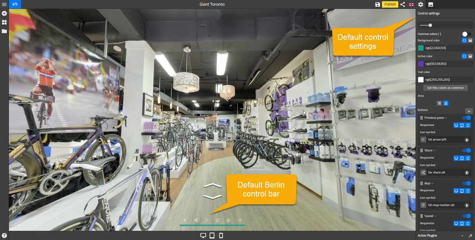
Berlin control bar is one of the four available options in the control center plugin. This control bar is highly customizable and can be used in the same way as the standard control bar.
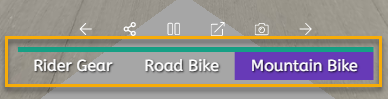
By default, the standard control bar comes with a white background and gray icons, whereas Berlin uses a green background and white icons. Both of them have almost the same setups but there is one unique feature of Berlin that this control bar allows you to set up clickable labels into the control bar.
How to add a Berlin control bar to your Overlay?
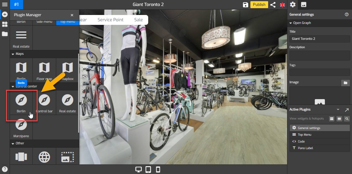
1. Click on the “+” icon (A key) to open the Plugin Manager for Hotspots, Menus, Maps, Control Center and Other. Then click Berlin under Control Center to open its control settings.
2. The default Berlin control bar appears at the bottom side and control settings menu on the right side of your overlay screen.
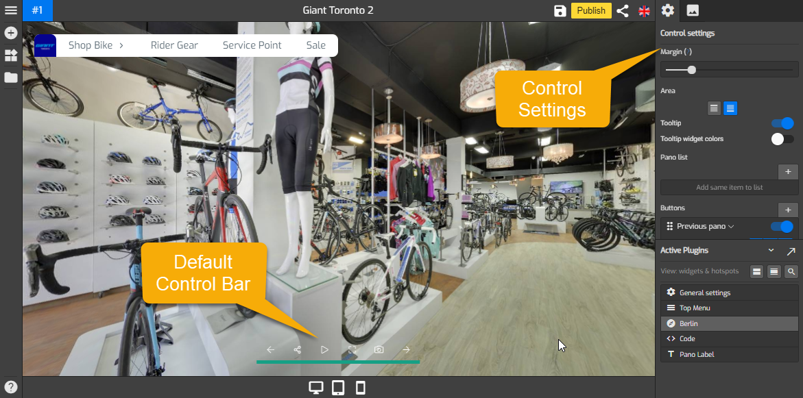
3. Change the design and setups of your control bar using the tools under the Control Settings so it can fit the entire constellation properly. For information about the tools under control settings, see “How to work with the Control Settings?” below.

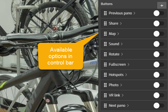
4. Set a button's state to either enabled or disabled by switching the toggle to on or off. The following are the buttons you can add to your overlay.
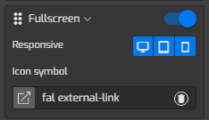
5. Click on the “Icon symbol” to change the button`s icon then select a representative icon for the button. You can also enable or disable the buttons for desktop, tablet, or mobile devices using the “Responsive” push buttons.
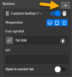
6. Add a customized button by clicking the “+” button to add a custom one. Select a representative icon then enter a website URL that will connect to the button.
7. Once you are happy with your control bar settings, just click “Save” and “Publish” to see the results.
How to use the tools under Control Settings?
The Following are the details how to work with the tools under the Control settings.
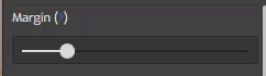
Margin
It adjusts the distance between control bar and the tour edges. Move the Margin slider to the left or right to adjust the position of the Control bar.
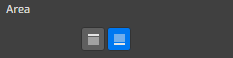
Area
It controls the position where the control bar is attached. You can place the control bar at the top or bottom side of your screen. Defaults to 'bottom side'.
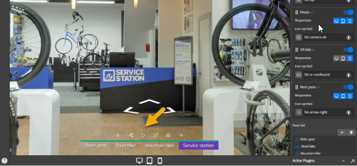
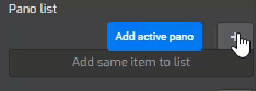
Pano List
Pano list allows you to add a label to a selected panorama. Click on the "+" button and type in the desired label that will connect to the panorama.
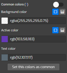
Color Settings
- Common colors: sets control bar colors connect to colors which in general setting.
- Background color: sets the color of control bar background.
- Active color: sets the color of active button in the control bar.
- Text Color: sets the color of button icon in the control bar.
- Set this color as common: sets the color which belongs to control bar plugin and determines the default colors choices for other plugins.
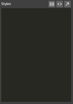
Styles
Styles at the lower part of the settings allows you to modify Berlin Control Bar plugin using css code. You can copy and paste your codes here then apply some changes to the plugin.
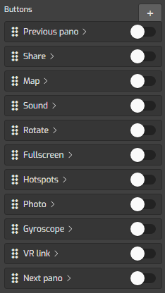
Buttons
This is the most important function that allows you to include some functional buttons to the control bar. The button options include the next and previous buttons, share buttons, map, sound, rotate, Fullscreen, hotspots, photo, gyroscope and VR link button. Set a button's state to either enabled, or disabled by switching the toggle to on or off and there will be different setup for each button.
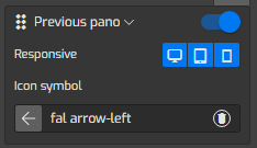
Previous pano
It is the button that connect to the previous pano. Switch on the toggle and use Responsive to enable or disable the buttons for desktop, tablet, or mobile devices. Icon symbol adds an icon to represent the button in control bar.
Next pano
This button connects to the next pano. Switch on the toggle then set the responsive and icon symbol.

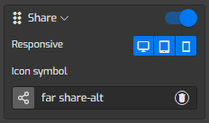
Share
It includes a social media sharing button to the control bar. These social share buttons give customers the ability to share the virtual tour on Facebook, Twitter, or other platforms.
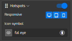
Hotspot
It includes a button that allows you to show or hide the hotspots.
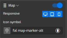
Map
This button allows you to show or hide the map.
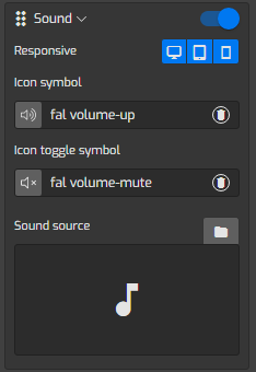
Sound
It is the button that enables or disables the sound of the tour. This is another great feature for playback of Gothru Overlay editor is audio integration. While it's not required, audio will make watching the tour much more enjoyable.
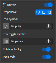
Rotate
This button allows you to play the tour as a video. If you enable this button, there are some options you need to set up to the playback such as Rotate autoplay, Pano walk, and Toggle pano. See the detail about the options in the section below.

The following are the information about options under Rotate button settings:
- Rotate autoplay: It enables a panorama automatically rotate once you click on the play button, the panorama will be panning around.
- Pano Walk: If you switch on the Pano Walk, the panoramas in the tour will load automatically, one after another at the specified time interval.
- Toggle Pano: You can select certain panoramas and set a duration at which the panoramas will be panning around. Switch on the “Toggle Pano on Choose” and select the panoramas you want to include.
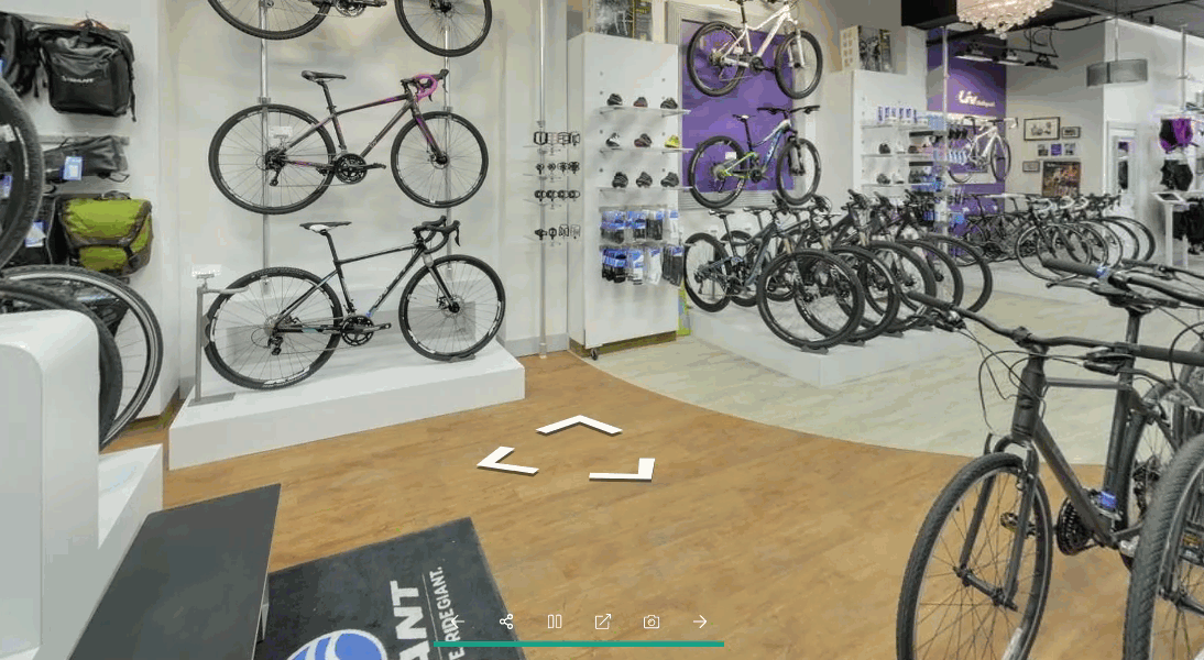
The best thing about these options, is that, even though you put the tour on automatic playback, the you can still interact with the panoramas.
You can see in the example below, the Rotate autoplay and Pano walk options are enabled.
Fullscreen
Full-Screen Button is a simple extension for your browser that helps you full-screen the virtual tour.

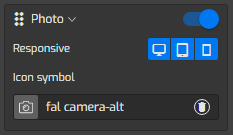
Photo
It is a button that captures the JPEG image from the active pano.
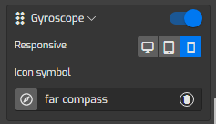
Gyroscope
It adds a button to measure the orientation or angular motion of the panorama.
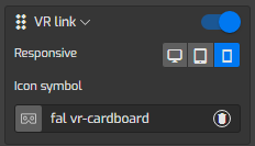
VR link
VR link adds a button that networks to a virtual reality application.