How to Work with Control Bar Plugin
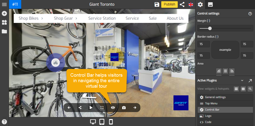
Control Bar is a control element on Gothru Overlay Editor that sets up on-screen buttons intended to aid visitors in accessing information and navigating the entire virtual tour. The control bar includes the next and previous buttons, share buttons, map, sound, rotate, Fullscreen, hotspots, photo, and VR link button.
Following are the steps to add a control bar on your overlay:
Step 1: Set up the control bar
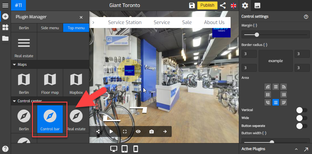
1. Click on the “+” icon (A key) to open the Plugin Manager for Hotspots, Menus, Maps, Control Center, and Other. Then click Control Bar to open its control settings.
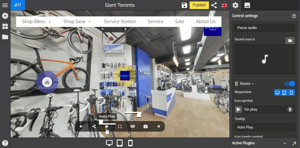
2. The default control bar appears on the bottom side and the control settings menu on the right side of your overlay screen. Change the style of the control bar using the tools under the Control Settings so it can fit the entire constellation properly.

3. Use Margin to adjust the distance between the control bar and the tour edges. Move the Margin slider to the right or right to adjust the position of the Control bar.

4. You can round the corners of the control bar outer border edge using Border radius. Increase the value in each field to make a rounded corner. If you click on the up arrow in the border radius field, GoThru Overlay automatically adjusts all 4 corners at once. To adjust one specific corner, click on the respected field and enter the desired number. The following example shows you the amount of roundness at 15-pixel border radius.

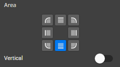
5. Then set the position where the control bar is attached using Area. Defaults to 'bottom side'. You can also set it to a vertical position.
6. You can change the layout to wide and button separate by switching on the Wide and Button separate toggles to enable them.

7. Width, Height and Icon size allow you to enlarge or adjust the size of the buttons on the control bar. Move the slider to the right to increase the size of the control bar and to the left to decrease it.

8. Tooltip and Tooltip widget colors used to enable the tooltip for each button on the control bar. You can edit the text of the tooltip using its menu under each button`s settings.

9. You can make your control bar more colorful using Control Bar Color Settings
- Common colors: sets control bar colors connect to colors which in general setting.
- Background color: sets the color of the control bar background.
- Active color: sets the color of the active button in the control bar.
- Text Color: sets the color of the button icon in the control bar.
- Set this color as common: sets the color which belongs to control bar plugin and determines the default colors choices for other plugins.
10. Styles at the lower part of the settings allows you to modify Control Bar plugin using CSS code. You can copy and paste your codes here then apply some changes to the plugin.
Step 2: Add buttons
This is the most important parts of the control settings that allows you to include functional buttons to the control bar. Set a button's state to either enabled, or disabled by switching the toggle to on or off.
Set a button's state to either enabled or disabled by switching the toggle to on or off.
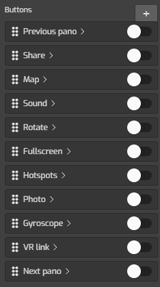
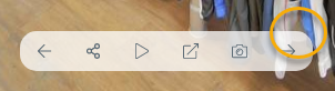
The following are the buttons (set to enable) you can add to your overlay.
- Previous pano - adds a button that connects to the previous pano.
- Next pano - adds a button that connects to the next pano.
- Share adds a social media sharing button.
- Hotspot - adds a button that shows or hides hotspots.
- Map - adds a button that shows or hides the map.
- Sound - adds a button that mutes or unmutes the sound of the tour.
- Rotate - This function adds a button that allows you to play the tour as a 360 video. There are some options you can set up to the playback, Rotate autoplay, Pano walk, and Toggle pano. This makes the playback of the virtual tour more varied and interesting.
- Fullscreen - adds a button that sets the tour to full screen.
- Photo - adds a button that captures JPEG image from the active pano.
- Gyroscope - Adds a button measuring the angular motion of an object.
- VR link - adds a button that networks to a virtual reality application.
- Custom button - You can also add a customized button to the control bar.
How to add the buttons?
You can set the button's state to either enabled or disabled by switching the toggle to on or off and there will be a different setup for each button. The following are the procedures on how to add some of the available buttons under the control settings.
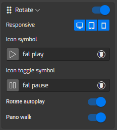
1. Rotate (Autorotate) Button
This button allows you to play the tour as a video. If you enable this button, there are some options you need to set up to the playback such as Rotate autoplay, Pano walk, and Toggle pano. See the detail about the options in the section below.

The following are the information about options under Rotate button settings:
- Rotate autoplay: It enables a panorama automatically rotate once you click on the play button, the panorama will be panning around.
- Pano Walk: If you switch on the Pano Walk, the panoramas in the tour will load automatically, one after another at the specified time interval.
- Toggle Pano: You can select certain panoramas and set a duration at which the panoramas will be panning around. Switch on the “Toggle Pano on Choose” and select the panoramas you want to include.
The best thing about these options is that, even though you put the tour on automatic playback, then you can still interact with the panoramas.
You can see in the example below, the Rotate autoplay and Pano walk options are enabled.
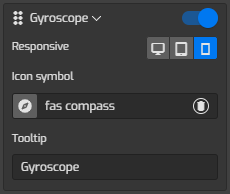
2. Gyroscope
It adds a button to measure the orientation or angular motion of the panorama.
How to add the Gyroscope button:
- Enable the button by switching the toggle to on.
- Click on the “Icon symbol” to change the button`s icon.
- You can also enable or disable the buttons for desktop, tablet, or mobile devices using the “Responsive” push buttons.
3. VR link
VR link adds a button that networks to a virtual reality application.
How to add the VR link button:
- Enable the button by switching the toggle to on.
- Click on the “Icon symbol” to change the button`s icon.
- You can also enable or disable the buttons for desktop, tablet, or mobile devices using the “Responsive” push buttons.

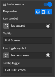
4. Fullscreen button
Full-Screen Button is a simple extension for your browser that helps you full-screen the virtual tour.
How to add the Fullscreen button:
- Enable the button by switching the toggle to on.
- Click on the “Icon symbol” to change the button`s icon.
- You can also enable or disable the buttons for desktop, tablet, or mobile devices using the “Responsive” push buttons.
Step 3: Save and Publish
Once you are happy with your control bar settings, just click “Save” and “Publish” to see the results.
